Global Temperature Trends
| Below are 30-year and 111-year global temperature trend maps. The darker the red, the greater the temperature increase trend. The darker the blue, the greater the temperature decrease trend. The rate of temperature increase/decrease was determined using simple linear regression. The temperature data comes from the University of East Anglia Climatic Research Unit. (Full citation) |
1982 - 2011 |
Annual Average Temperature 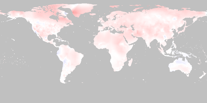
January 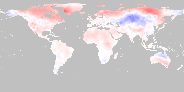
February 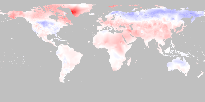
March 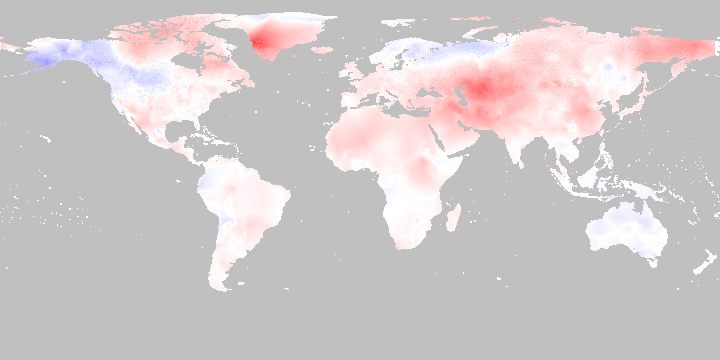
April 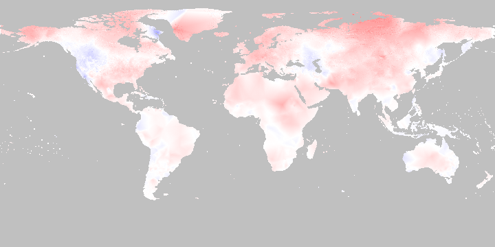
May 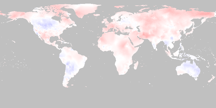
June 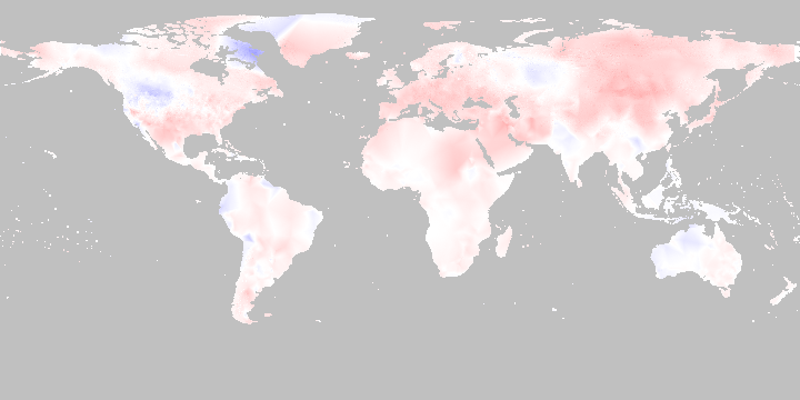
July 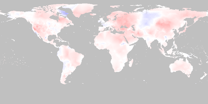
August 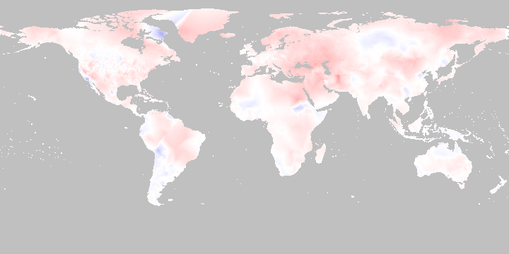
September 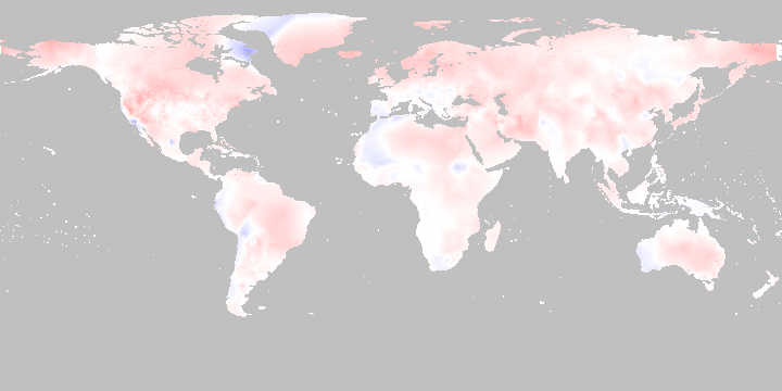
October 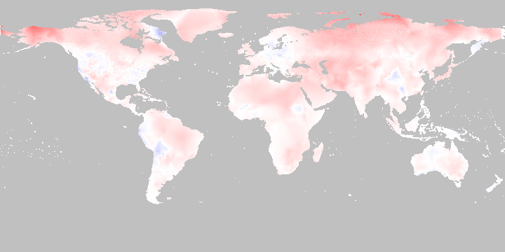
November 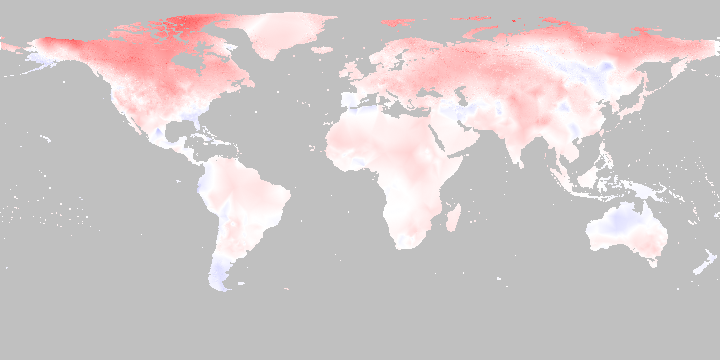
December 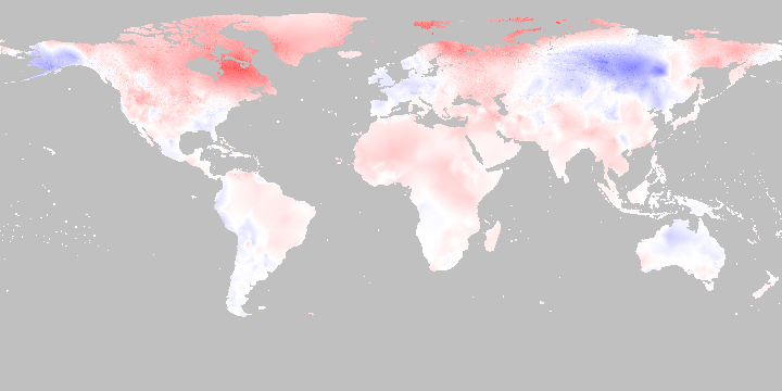
|
1901 - 2011 |
Annual Average Temperature 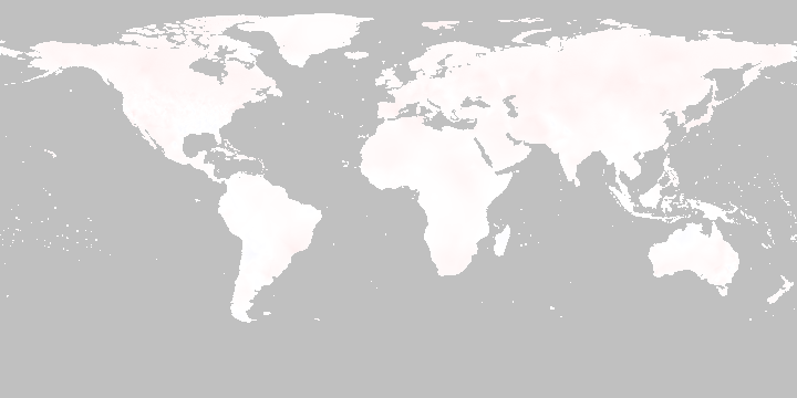
January 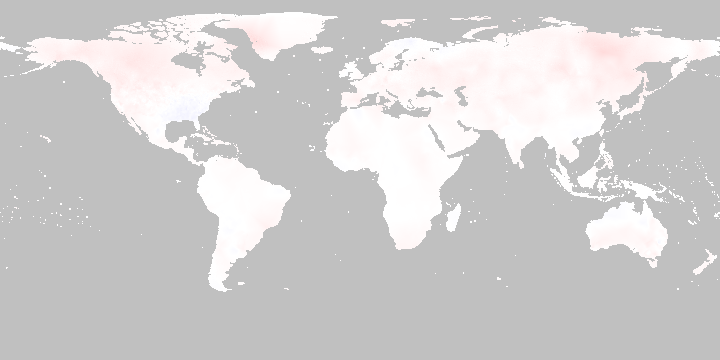
February 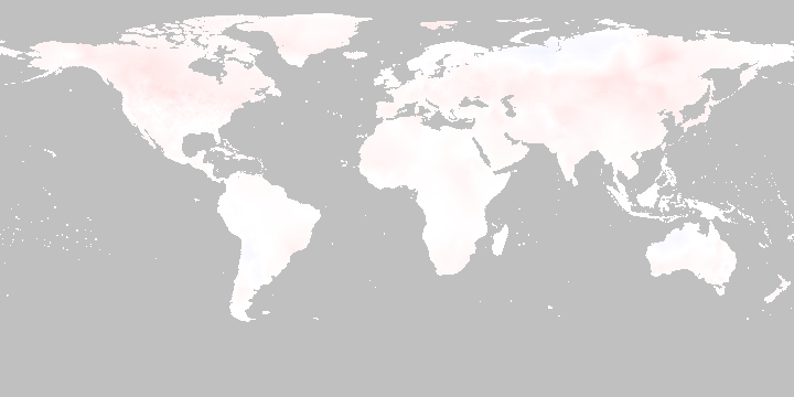
March 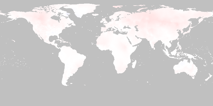
April 
May 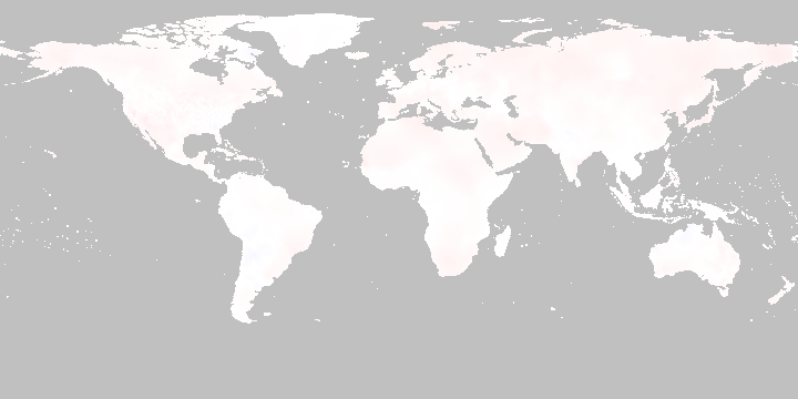
June 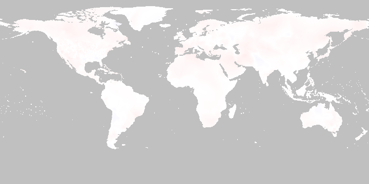
July 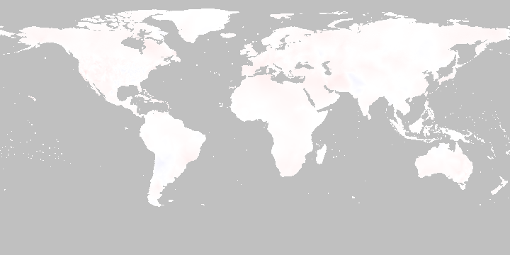
August 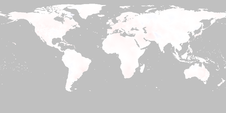
September 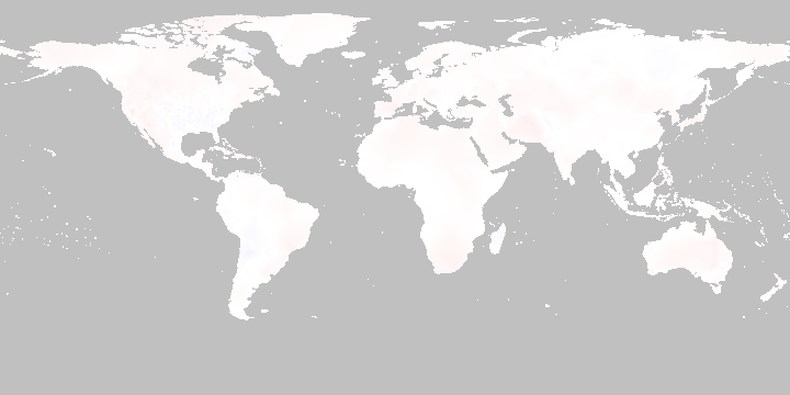
October 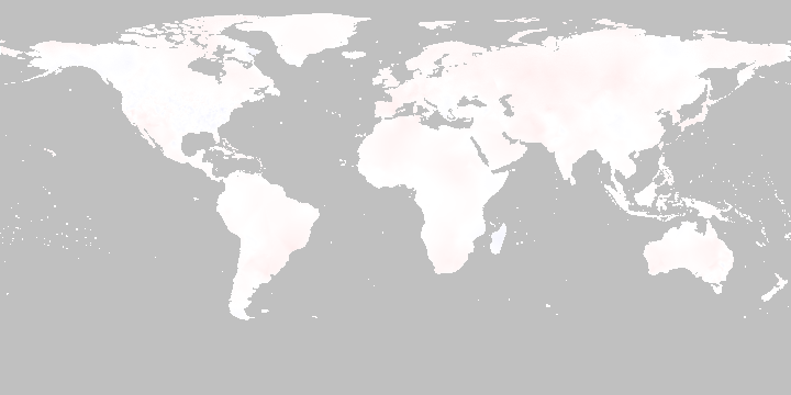
November 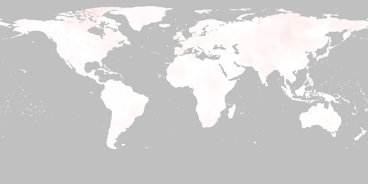
December 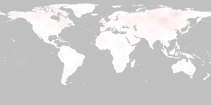
|
| Data provided by University of East Anglia Climatic Research Unit (CRU). [Phil Jones, Ian Harris]. CRU Time Series (TS) high resolution gridded data version 3.20, [Internet]. NCAS British Atmospheric Data Centre, 2012, July 26, 2013. |